ͼ������
��������ʱ��ע�����¼��㣺
��һ�� ����ʱ������Ҫ���պ�ͼ���ı�����Ϣ�⣬ ��Ҫ����ͼ�����㺬�壬��ԭ��Դ�����ܵķ�չ���Ƶȡ�ͼ�������ṩ��˵���������������������㣬һ��Ҫ��ϸ������
�ڶ��� ��������ʱҪץס�ص㣬Ϊ���ķ���������㵽���мɺ���Ŀ�ĵ�����ͼ���е����ݡ�������ݽ϶࣬ץסͼ���еļ��˵㣨��������С���������٣���û����ͻ�����ͬ����������
������ �����Ӧ��ȷ����÷������µĿ�ͷ��������ʹ�ص�ͻ�����������ˡ�
����ģ��
��һ�Σ���������ͼ����ָ��ʱ��Σ�ָ��ͻ���仯��ͬ
���þ��ͻ���
As is clearly shown in the char/ table/graph, ___________
According to the figures given in the table/chart/graph, ____________
It can be seen from the table/chart/graph, _____________________.
The figures in the table/chart reflect that ________________.
especially, ________________��ָ��ͻ���仯��
�ڶ��Σ�������ԭ��
There are several factors leading to this change / difference ����..
There are several reasons for _____________.(����ԭ��)
To begin with, _______(ԭ��һ)
In addition, ______________��ԭ���0
For example, _________������˵����
Last but not the least, __________��ԭ������
To sum up��������������������������������Ҫ�ܽᣩ
�����Σ��Լ��Ĺ۵�
As for me, ____________
On the one hand, ________
on the other, ____
In brief��_____________________.
���ݱ仯���þ���
��ʾ�������
The number of ��. has grown steadily from �� to��..in 2009.
has risen from ��.
shows a tendency to increase
climbed
went sharply up
soared
tends to go up b/ increase
There was a rapid / sharp / dramatic / gradual / slow increase / rise in the number of ��. who��..
The number of ��. is on the rise / increase.
The increase of ��. has reached to ��.
��ʾ���ݽ���
The number of �� dropped steadily from �� to ��in 2008.
declined suddenly
fell
tends to go down
tendency to fall
shows a tendency to decrease
There was a sharp fall ��. in the number of �� in 2008.
gradual decrease
sudden reduction
slow decline
drop

���ģ� Students Use of Computers
��٣� 1. ��ͼ��ʾΪijУ��ѧ��ƽ��ÿ��ʹ�ü������ʱ�䣺 1990�꣨2 hours��, 1995�� (4 hours), 20##�� (14 hours)����������仯��
2. ��˵��������Щ�仯��ԭ�ɴӼ��������;���۸����ᷢչ�ȷ������˵������
3. ����ΪĿǰ��ѧ���ڼ����ʹ������ʲô���ѻ����⡣
�����(1)
Student Use of Computers
As is clearly shown in the chart, the number of hours students spent on computers increased from two to four hours per week from 1990 to 1995. Especially, the number rose to about 14 hour per week in 2002.
There are three factors leading to the change. To begin with, the price of computers is getting much lower than before so that many students can afford it. In addition, it is very convenient for us to study with the help of computers. For example, e-mails enable us to keep in touch with our teachers and friends. Last but not least, with fast development of the modern society, a computer has become a must for many people. To sum up, low price, convenience and wide use contribute to the increase in the use of computers.
As for me, student use of computers is a double-edged sword. On the one hand, it is a good helper in searching for information, drawing pictures, etc. One the other hand, various computer games might distract students from their studies. In brief, computers can serve us well if they are used in the right way.
�ο����ģ�2��
Student Use of Computers
As is clearly shown in the chart, the average number of hours a student spent on computers increased from two to four hours per week from 1990 to 1995. Especially, the number reached approximately 14 hour per week in 2002. Why are there such great changes during these days?
There are three factors leading to this phenomenon. Firstly, because of the sharp decline in the price of computers, most college students can afford one. Secondly, the Internet provides access to various kinds of information students are interested in. Finally, playing computer games or surfing online is relaxing. To sum up, low price, easy access to information and wide use make students use computers a lot.
As for me, computers do bring convenience to students; however, it is no good fro students to spend too much time chatting online or playing computer games. In brief, in spite of the problems concerning the use of computers, we can��t deny that computers are of more merits than defects.
�ο����ģ�3��
Student Use of Computers
Using computers has become a common part of people��s life. And the tremendous growth of student use of computers has always aroused the greatest concern. What impresses us most is the number of hours students spend on computers. In 2002, they spend as many as 14 hours per week on computers.
The reasons why computers as widely used are varied. Among them, the decreasing price of PC plays an important part. What��s more, the Internet provides college students an amazing world to explore. For example, they can get the latest news and make friends conveniently around the world.
Whey talking about the disadvantages and problems existing in student use of computers, I think that their lack of skills and discipline is what should be paid attention to. On the one hand, the lack of skills fails students to make good use of the computer and the Internet. On the other hand, their lack of necessary discipline makes some students indulge in computer games and the net world, forgetting their major tasks as college students. In brief, there is still a lot to do to help students make good use of computers.
�ο����ģ�4��
Student Use of Computers
Reading this chart, we can find that the average number of hours students spend on computers per week has increased sharply. In 1990, it was less than two hours; in 1995, it increased to almost four hours; and in 2005, the number soared to 14 hours per week.
There are several reasons for this phenomenon. First, computers provide facilities for us in many aspects of life. In addition, the fast development of the Internet contributes to our increasing demand for computers. We can easily contact friends in faraway places through the Internet. Besides, the prices of computers are getting lower and lower, which enables us to purchase them.
However, there are still some problems. For example, computers may crash from time to time because of viruses transmitted through the Internet. And how to balance the time between using computers and studying is also a serious problem. Anyway, we will benefit a lot from computers as long as we use them properly.
Sample 1
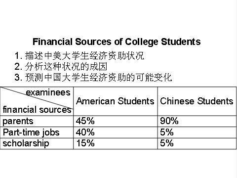
Financial Sources of College Students
From the table, we can see clearly that Chinese college students and their American peers rely on different financial sources for their life and study. About 90% of Chinese students get money from their parents. In contrast, only 45% of American students resort to this way. About 40% of American students depend on part-time jobs for income, but only 5% of Chinese students do so. Scholarship is the financial source for 15% of American students, whereas only for 5% of Chinese students.
There are several reasons leading to this difference. On the one hand, independence is greatly honored in American society, and students would be proud to depend on themselves. Besides, they have a more flexible schedule so they can have more time to do part-time jobs. On the other hand, some Chinese students take their parents�� financial support for granted. Similarly, parents believe it��s their duty to finance their children��s education.
I think with the reform in college education, this tendency in China may be changed. The widespread adoption of credit-system will give Chinese students more time and flexibility to pursue part-time jobs and get more independence from their parents. Also, with the passage of time, both the students�� and the parents�� ideas will change greatly. Thus, more and more Chinese college students are sure to rely on themselves rather than on their parents for finance.
Sample 2
Financial Sources of College Students
According to the table, the number of Chinese students who get money from their parents doubles that of American ones, 45% and 90% respectively. But the percentage of American students who depend on part-time jobs is much larger than that of Chinese ones. It can also be seen clearly that scholarship is the financial source for 15% of American students, while only for 5% of Chinese students.
Several factors can account for the above difference. For one thing, independence is highly honored in American society and students take great pride in self-reliance. For another, American students have a more flexible schedule so they can have more time to do part-time jobs. Another contributing factor is that both Chinese students and their parents take parents�� financial support for granted.
The tendency for Chinese college students to rely on their parents for finance may be changed. The widespread adoption of credit-system will give Chinese students more time and flexibility to pursue part-time jobs and get more independence from their parents. What��s more, great changes may take place not only in the students�� ideas but also in their parents��, which, in turn, will lead Chinese students to regard it as a pride to be self-reliant.
��ͼ�����ĵ�ƪ�½ṹ
����дͼ������ʱ������������ʽ��ıƪ��ʽ�����µĵ�һ����������ͼ���е����ݱ仯��ӳʲô��������ƣ�����ͼ������ʾ����Ϣ���ڶ��η��������һ��������Ƶ�ԭ��������չ��δ�������������������İ취���顣��һ�ṹ���Լر���Ϊ��
������һ�Σ�����ͼ����ӳ������˼��
�����ڶ��Σ�����������ԭ��
�����Σ�չ��δ���������������
����ͼ�����ij��õľ���
����(1)���õĿ�ƪ����(������ͼ������ʱ���õı��)
������ According to the table/pie chart/line graph/bar graph, we can see/conclude that �� ���ݸñ�/ͼ�����ǿ�֪ ����
������ The table/graph reveals (shows/indicates/illustrates/ represents/points out) that �� �ñ�/ͼ��������
������ As we can see from the table ��
����As can be seen from the line/bar graph ��
����As is shown (illustrated/indicated) in the pie chart ��
�������/ͼ��ʾ������
����(2) ���������仯���õľ���
������ Compared with �� is still increased by ��
�� The number of �� grew/rose from �� to ��
������ An increase is shown in ��; then came a sharp increase of ��
������ In �� the number remains the same/drops to ��
�� There was a very slight (small/slow/gradual) rise/increase in 1990.��
��There was a very steady (marked/sharp/rapid/sudden/ dramatic) drop (decrease/ decline/ fall/ reduction) in 1998/ compared with that of last year).
�� �����Ǹ�����2����ĿҪ��д�ķ��ġ�
������From the graph, we can see that the number of car accidents in Walton city fluctuated during the year of 1990. ��The first two months of 1990 showed an increasing trend. ��The rate rose to 32 in March but fell to 26 in June. ��From June on, the rate was rising again and reached the peak point 39 in August. ��After August the rate began to decline remarkably, and eventually dropped to the lowest point 16 at the end of the year. ��Therefore, it��s obvious that car accident in Walton city declined in 1990.�������/��������ӳ�����ݢơ�(5)��ӳ��ͨ�¹ʵı仯���(6)С��ܽ�������ݷ�ӳ��������
������There are several reasons for the decline. ��First, a new traffic law was made and came into force. ��It provided that in summer every car must be air-conditioned. ��As a result, the highest rate in August, when humidity and high temperature make drivers impatient and easily lead to car accidents, dropped steadily. ��Second, new roads were built and some narrow streets were widened, which quickened the flow of traffic. ��Finally, the city administration made great efforts to heighten people��s awareness of observing traffic rules.��������ԭ��/��ʩһ�ͽ��ʹ�ʩһ/��Ҫ�����β�ȡ��ʩһ��Ľ����ԭ��/��ʩ����ԭ��/��ʩ��
��With all these new measures, I��m sure the rate of car accidents in Walton city will go on falling this year.���ܽչ��δ�������
ͼ������������
һ��ͼ������д����ʶ
����1��ͼ�����༰��������
������ָһ������ͼ����a data graph/chart/diagram/illustration/table
������ͼ��pie chart
����ֱ��ͼ������ͼ��bar chart / histogram
������������ͼ��line chart / curve diagram
��������ͼ��table
��������ͼ�����ͼ��flow chart / sequence diagram
��������ͼ��processing/procedures diagram
����2�����õ������÷�
����The table/chart diagram/graph shows ��that��
����According to the table/chart diagram/graph
����As ��is�� shown in the table/chart diagram/graph
����As can be seen from the table/chart/diagram/graph/figures��
����figures/statistics shows ��that������
����It can be seen from the figures/statistics
����We can see from the figures/statistics
����It is clear from the figures/statistics
����It is apparent from the figures/statistics
����table/chart/diagram/graph figures ��that�� ����
����table/chart/diagram/graph shows/describes/illustrates how����
����3��ͼ���е����ݣ�Data��������
�������ݣ�Data����ijһ��ʱ��ι̶����䣺fixed in time
������һϵ�е�ʱ�����ת�䣺changes over time
���������仯��data�ڲ�ͬ����£�
�������ӣ�increase / raise / rise / go up ����
�������٣�decrease / grow down / drop / fall ����
����������fluctuate / rebound / undulate / wave ����
�����ȶ���remain stable / stabilize / level off ����
������õ����ֱ����
��������+������ʽ��Verb+Adverb form��
�������ݴ�+������ʽ��Adjective+Noun form��
��
������س��ô���
����1�����¿�ͷ
����ͼ�����ͣ�table��chart��diagramgraph��column chart��pie graph
����������show��describe��illustrate��can be seen from��clear��apparent��reveal��represent
�������ݣ�figure��statistic��number��percentage��proportion
����2����ʾ���ݱ仯�ĵ��ʻ��ߴ���
����rapid/rapidly��Ѹ�ٵģ��ɿ�ģ��վ���
����dramatic/dramatically��Ϸ���Եģ�������
����significant/significantly��������ģ��ش�ģ���Ҫ��
����sharp/sharply�������ģ����Եģ������
����steep/steeply������������
����steady/steadily���ȹ̵ģ��ᶨ���Ƶ�
����gradual/gradually�������ģ���
����slow/slowly�������ģ�����Ծ��
����slight/slightly�����ġ�����
����stable/stably���ȶ���
����3�������������еij��õ��Ĵ�
����significant changes��ͼ��һЩ�ϴ�仯
����noticeable trend����������
����during the same period����ͬһʱ��
����grow/grew������
����distribute���ֲ�������
����unequally������ȵ�
����in the case of adv.���ڡ����������
����in terms of / in respect of / regarding���ڡ�������
����in contrast���෴������ͬ
����government policy����������
����market forces�������
����measure ��n.�ߴ磬��������ʩv.����������
forecast�� n.�ȼ���Ԥ��v.Ԥ��
����Ӣ��ͼ��д���侫ѡ
����1.the table shows the changes in the number of����over the period from����to����
�����ñ����������ڡ�����֮������䡭�������ı仯��
����2.the bar chart illustrates that������������״ͼչʾ�ˡ���
����3.the graph provides some interesting data regarding����
������ͼΪ�����ṩ���йء�����Ȥ���ݡ�
����4.the diagram shows ��that������������ͼ������չʾ�ˡ���
����5.the pie graph depicts ��that������������Բ��ͼ��ʾ�ˡ���
����6.this is a cure graph which describes the trend of�����������ͼ�����ˡ��������ơ�
����7.the figures/statistics show ��that�������������ݣ��֣���������
����8.the tree diagram reveals how��������������ͼ�����ǽ�ʾ����Ρ���
����9.the data/statistics show ��that���������������ݣ��֣������������⡭��
����10.the data/statistics/figures lead us to the conclusion that����
������Щ�������������ǵó����ۡ���
����11.as is shown/demonstrated/exhibited in the diagram/graph/chart/table����ͼ��ʾ��
����12.according to the chart/figures��������������Щ�������֣�����
����13.as is shown in the table���������������ʾ����
����14.as can be seen from the diagram��great changes have taken place in����
������ͼ�п��Կ��������������˾�仯��
����15.from the table/chart/diagram/figure��we can see clearly that����or it is clear/apparent from the chart that����������ͼ�����ǿ��Ժ���������ԣ���������
����16.this is a graph which illustrates�����������ͼ��������չʾ�ˡ���
����17.this table shows the changing proportion of a & b from����to����
�����ñ��������ˡ����굽�������a��b�ı�����ϵ��
����18.the graph��presented in a pie chart�� shows the general trend in����
������ͼ��Բ��ͼ��ʽ�����ˡ����ܵ����ơ�
����19.this is a column chart showing�����������Ǹ�����ͼ�������ˡ���
����20.as can be seen from the graph��the two curves show the fluctuation of����
������ͼ��ʾ���������������ˡ����IJ��������
21.over the period from��to��the��remained level.���ڡ������ڼ䣬���������䡣
����22.in the year between����and���������ڡ����굽�����ڼ䡭��
����23.in the 3 years spanning from 1995 through 1998��������1995����1998�������
����24.from then on/from this time onwards������������ʱ�𡭡�
����25.the number of����remained steady/stable from ��month/year�� to ��month/year����
���������£��꣩�������£��꣩�����������������䡣
����26.the number sharply went up to�����������ּ�������������
����27.the percentage of��stayed the same between��and���������ڼ䡭�ı���ά�ֲ��䡣
����28.the figures peaked at����in��month/year����������Ŀ�ڡ����£��꣩�ﵽ���㣬Ϊ����
����29.the percentage remained steady at������������ά���ڡ���
����30.the percentage of��is slightly larger/smaller than that of�����ȡ��ı����Ըߣ��ͣ���
����31.there is not a great deal of difference between����and�������롭��������
����32.the graphs show a threefold increase in the number of����
������ͼ��������������Ŀ������������
����33����decreased year by year while����increased steadily.
��������������٣���������������
����34.the situation reached a peak��a high point at�� of[%].
������������������ƣ����ﶥ���ߣ��㣬Ϊ�����ٷֵ㡣
����35.the figures/situation bottomed out in�����������֣�������ڡ����ﵽ�ײ���
����36.the figures reached the bottom/a low point/hit a trough.���֣�������ﵽ�ײ����ȣ���
����37.a is ����times as much/many as b.����a��b�ġ�������
����38.a increased by��������a�����ˡ���
����39.a increased to��������a����������
����40.high/low/great/small/ percentage.�����ȵߣ��ͣ�
����41.there is an upward trend in the number of���������������ֳ��������ơ�
����42.a considerable increase/decrease occurred from����to��������������������������
����43.from����to����the rate of decrease slow down.�����ӡ������������½����ʼ�����
����44.from this year on��there was a gradual declinel reduction in the������reaching a figure of���������������𣬡������½�������
����45.be similar to���������롭������
����46.be the same as���������롭����ͬ
����47.there are a lot similarities/differences between����and����
���������롭��֮�����������ƣ���ͬ��֮��
����48.a has something in common with b����a��b�й�֮ͬ����
����49.the difference between a and b lies in��������a��b֮��IJ�����ڡ���
����50������year��witnessed/saw a sharp rise in�������������ꡭ����������
��ͷ��ת����Ŀ���þ���
The line graph describes/ illustrates/ demonstrates/ summarizes/ outlines/ shows��
��������ʻ��ߴӾ�
��ͷ�λ���������������ݻ������Ƴ��þ���
According to/ As shown in/ As can be seen from�� �����ͼ��������
It can be seen from �������ͼ�������͡� that
It is manifest from�������ͼ�������͡� that
��ʾ�����Ķ���
Go up(went up) /rise(rose)/ grow(grew)/ increase(increased)/ ascend(ascended) , ����
rise��increase Ҳ����������, grow-growth
��ʾ���������Ķ���
Jump(jumped)/ surge(surged)/shoot up (shot up)/ soar(soared) ����surgeҲ����������
��ʾ�½��Ķ���
Decline/ fall/ drop/ sink/ dip/ decrease/ descend, ����decline/ fall/ drop/ decreaseҲ����
������
��ʾ�����½��Ķ���
Plummet/ plunge
��ʾ�ٶȿ�����ݴ�
Sharp/ dramatic/ drastic/ rapid/precipitous/steep ���ʼ� -ly
��ʾ���ȴ�����ݴ�
Marked/ substantial / significant, ���ʼ� -ly
��ʾ����,�����ݴ�
Gradual/ steady/ gentle / slow, ���ʼ� -ly
��ʾС���ȵ����ݴ�
Modest/ moderate/ slight, ���ʼ� -ly
��ʾ�����Ķ���
Fluctuate, �����ﶯ��,����fluctuation
��ʾ�ȶ���һ��ˮƽ�ϵĶ���
Level off at/ level out at/ hover at/ stabilize at/ reached a plateau at
��ʾ�ﵽ��ߵĶ���
Peak at/ reach the highest point at , peak Ҳ����������
��ʾ�ﵽ��͵Ķ���
Reach the bottom at/ the lowest point at/ bottom out at, bottom Ҳ����������
��ʾ������ij�ֱ仯�ļ��ﶯ��
Experience/ witness/ see
��ʾ�ﵽ�˶��������ļ��ﶯ�ʻ����
Reach/arrive at/ amount to / hit/ register/ stand at
��ʾռ��(������ٷ���������)�ļ��ﶯ�ʻ����
Account for/ represent / constitute / make up
��ʾ������ij����������ɵļ����ʻ��ߴ���
A is composed of/comprise/ is made up of/ consists of B,C and D. ע���include ����
��ʾ��δ�����ֵ�Ԥ��ļ��ﶯ��
Project/ predict / forecast
��ʾ"�ֱ�"�ĸ���
Respectively��in the 20## Olympics, China and Russia won X and Y gold medals
respectively.
��ʾ"��Լ"�ĸ��ʻ��ߴ���
About, around, approximately, roughly, just over, just under
ͼ�����ģ�����
����1
DIRECTIONS: A. Study the following graphs carefully and write an essay in at least 150 words. B. Your essay must be written clearly on the ANSWER SHEET II. C. Your essay should cover these three points:
1. effect of the country��s growing human population on its wildlife
2. possible reason for the effect
3. your suggestion for wildlife protection
���������ͷ�����
��һ�� �ڶ��� ������
ͼ��/ͼ�������� ԭ����Ͷ� �����ʩ��
���ο�����һ��
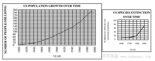
From these graphs, we can draw a conclusion that, with the growth of human population, the number of species has decreased rapidly in America, and some species have even vanished from our planet.
There are numerous reasons accounting for the phenomenon and I would like to explore a few of the most important ones here. Above all, as the human population grows rapidly, a growing number of people came to live where some wild species have been living. Then these species have to move to other places. Some of them probably can not adapt to the new environment and die. In addition, although many people look on the wildlife as their friends, some people may not think so. They catch a lot of wild animals and sell them in order to get more money. Consequently, the natural balance and the ecologic environment are destroyed. The clear cutting has become increasingly serious. So some of the wildlife become homeless and extinct.
In order to protect the wildlife, I have some suggestions. First, the governments should make laws to prevent them from being caught and killed. Second, the governments should educate people to love nature and protect it. Third, as for ourselves, we should take practical actions to protect our living environment. (210 words)
���ο����Ķ���
The two charts show that the increase in the U.S. population has been accompanied by a corresponding decline in the number of wildlife species. Far too many species have been lost already. This poses a danger to the ecological balance.
As the human population expands, wild animals in mounting numbers are hunted for food, or because they are thought to present a threat to man. But studies show that one of the primary causes of the disappearance of wildlife is pollution, which is one of the consequences of population growth and economic development. This makes us wonder if men are able to share this planet in harmony with other life forms.
In my opinion, it is imperative for us to take steps to reverse the disturbing trend illustrated in the charts. One measure would be to forbid the building of cities in areas where wild life is threatened with extinction. But, more importantly, men must learn to stop polluting the environment, or he himself will be extinct. (167 words)
�����������
As is seen from the two graphs, it is clear that with the rapid growth of U.S. population from 1800 to 1990, the number of its wildlife species no longer existing soared during the same period. Naturally, we can draw the conclusion that the sharp decline of wildlife species resulted from the population growth.
Several reasons may account for this phenomenon. To begin with, as the population grows, people consume much more natural resources. Second, with the increase of human activities, modern people take up more and more space which exerts a great influence on other species. Finally, the problem of pollution becomes more and more serious with the development of modern industry. More and more animals have to adapt themselves to the decaying environment or move to a totally different place, but not all of them are fortunate enough to survive the changes.
Solving this problem calls for, above all, the government��s efforts to control population growth, to decrease industrial pollution and to enhance the laws to forbid wildlife hunting. Moreover, common citizens should be aware of this ecological crisis and take on the responsibility of wildlife protection. In a word, only when the government and the common people make joint efforts can we hope to find a satisfactory solution to this problem. (216 words)
����2
ͼ��
The line graph illustrates how the number of people using a London underground station fluctuates over the course of 16 hours (6am to 10pm).
As we can see from the graph, at 6am the number of people at the station stands at only 100. The number shoots up over the next two hours, peaking at 400 at 8am. Then the number descends drastically for two hours, bottoming out at 180 at 10am. The period between 10o'clock and 12o'clock witnesses a moderate growth in the number of people in the station, with the number reaching 280 at midday. Numbers in the following two hours stabilize at just under 300 people. Then the number plummets to only 100 from 2pm to 4pm. Then the next two hours see a dramatic rise again, with 6pm registering 380 people. After 6pm, the number dips again, reaching the lowest point of 130 at 8pm. The period from 8pm to 10pm experiences a slight rise, but then the number of people declines again from 180 at 9pm to 135 at 10pm.
This line graph clearly demonstrates that rush hours in the early morning and the early evening are periods when the station is used by the most people.
����3
The diagram illustrates in four stages the recovery of the forests in Yellowstone National Park after a devastating forest fire.
In the first picture, while the old forests still exist, they drop bad wood to the soil under them, which renders the soil more fertile. Then lightning and fire strike, destroying the forests completely. And the growth of new forests starts right at this point. The second picture demonstrates that in the first 50 years after the devastating fire, saplings grow in build while descend in overall number. In the next two centuries, the young trees continue to thrive in Yellowstone, because of the fertile soil and the ample sunlight. Then, three hundred years after the fire, the number of trees decline to roughly the same as the old forests.
These five pictures show us that it takes as long as three centuries for a destroyed forest to fully recover. Further, they vividly explain to us the natural law of "survival of the fittest". The number of trees that a region can support is not limitless, which means the forests on earth will not be an inexhaustible resource.
����4
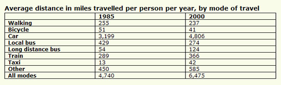
The table below gives information about changes in modes of travel in England between 1985 and 2000.Summarise the information by selecting and reporting the main features, and make comparisons where relevant.
����1
The table indicates the number of miles by the average English person in 1985 and 2000, using various means of transport.
The number of miles walked, cycled and travelled by local bus all decreased. Of these, the number of miles travelled by local bus decreased the most, from 429 miles in 1985 to 274 miles in 2000.
The number of miles travelled by car, long distance bus, train and taxi all increased.
The number of miles driven by car was 3,199 in 1985 and rose by 50% to 4,806 in 2000. The number of miles travelled by long distance bus more than doubled from 54 miles (1985)to 124 miles (2000). The number of miles driven by taxi trebled from 13 miles (1985) to 42 miles (2000). The use of other, unspecified, forms of transport also increased.
Overall, the number of miles travelled by the average English person rose from 4,740 miles in 1985 to 6,475 miles in 2000, with the increase of cars accounting for almost all of that increase. (173 words)
����2
The table demonstrates how different modes of travel changed in England in 15 years spanning from 1985 to 2000. In general, the modes are classified into two kinds in terms of average miles travelled per person per year: one enjoyed rising popularity while the other decreasing.
The travel modes which gained popularity in the period included cars, long distance buses, trains, taxis and others. Cars remained top among the modes in the 15 years, with its average miles increasing considerably from 3,199 in 1985 to 4,806 in 2000. Long distance buses and taxis seemed to be warmly welcomed by travelers, so average miles travelled in the two modes almost tripled.
Travels by walking, bicycles and local buses lost travelers�� favor in the one and a half decade. Average travelling distance by local buses suffered the biggest decrease, dropping from 429 to 274, whilst the number of miles by walking and bikes fell mildly from 255 to 237 and from 51 to 41 respectively. Despite the decreases, however, the total miles travelled grew from 4,740 to 6,475.
In brief, the total travelling distance in the country grew in 15 years when cars, long distance buses, trains, taxis and other modes of travel were more popular and walking, bicycling and local transportation less popular. (212 words)
����5
Directions: For this part, you are allowed 30 minutes to write a composition of no less than 100 words on Income Sources between Chinese and American Students. Study the following table carefully and your composition must be based on the in formation given in the table. Write three paragraphs to:
1. Describe the differences of the income sources between Chinese and American students.
2. Analyze possible reasons for these differences.
3. Predicate future tendency.
Source of income Percentage of Total Income
______________________________________________________________________________
Parents Part-time job Fellowship or Scholarship
American students 50% 35% 15%
Chinese students 90% 5% 5%
_______________________________________________________________________________
����: Income Sources Between Chinese Students and American Students
Income sources of Chinese students are quite different from those of American students. In China, students get 90% of their money from their parents while in America, only 50% of students` money is provided by parents. In addition, Chinese students earn only 5% of their money from part time jobs and 5% from fellowship or scholarship while income from these two resources for American students takes up 35% and 15% respectively of their total income.
I think there are probably three reasons for their differences. First, because of the influence of different social and family values, Chinese students have formed the habit of asking for money from their parents while American students have developed more sense of being financially independent. Second, most Chinese parents devote too much care to their children and they would rather save up to afford their children��s education rather than encourage them to take part-time jobs. But in America, many parents pay more attention to developing the students�� ability of self-reliance, so they encourage their children to find part-time job to earn some money by themselves. Third, since America is more developed than China, it is relatively easy for students to find part-time jobs. In China, such opportunities are rather rare.
I believe with the development of China, more and more Chinese students will realize and pay more attention to the necessity of self-dependence. In addition, more and more opportunities will be provided for them to take part-time jobs. So more students will go out of the ivory tower to broaden their knowledge and to become the master of their own lives.
����6
For this part, you are allowed thirty minutes to write a composition on the topic: Student Use of Computers. You should write at least 120 words, and base your composition on the chart and the outline given below:
1.��ͼ��ʾΪ1990�ꡢ1995�ꡢ20##��ij��ѧ��ʹ�ü�������������������仯��
2.��˵��������Щ�仯��ԭ��(�ɴӼ��������;���۸����ᷢչ�ȷ������˵��)��
3.����ΪĿǰ��ѧ���ڼ����ʹ������ʲô���ѻ����⡣
����: Student Use of Computer
Since 1990, there has been tremendous growth in the use of computers by students. While in 1990, the average number of hours a student spent on the computer was about one hour per week, this number grew to nearly four hours per week by 1995, and to approximately 20 hours per week by the year 2000.
This significant growth in the use of computers by students in the 1990��s can be attributed to several factors, including widespread usage, lower prices, and technological and social developments. Nowadays, computers are widely used by students for word processing, book keeping, multimedia presentations, and access to the Internet for both research and communications. Additionally, since 1990, due to competition and technological advances, computer hardware and software prices, as well as Internet usage charges have dropped significantly. Finally, technological developments and changes in social habits in the 1990��s have played a major role in this tremendous growth in the use of computers. Today��s society relies heavily on computers for immediate access to the news and for entertainment, including, listening to music, watching movies and sport events, and playing computer games.
While computers are of great assistance to the students, and therefore, are indispensable tools, they also pose some challenges. The biggest challenge that many students face is discipline in the use of this powerful device. That is, students need to have the discipline of not allowing themselves to be lured by the entertaining aspects of this wonderful tool��aspects that can result in addiction to computer games or viewing of undesirable material on the Internet. That is to say, students need to use this powerful tool with great wisdom!
����7
The graphs below show the age structure of a European country from 1901 to 1981 and a prediction for 2021. Summarize the information by selecting and reporting the main features, and make comparisons where relevant. You should write at least 150 words.
Sample Answer
The graphs compare the population makeup of one European country every forty years from 1901 to 1981, and the estimated number in 2021.
There was a huge increase in the number of people in this country from 38,225,000 in 1901 to 67,180,000 eighty years later, and this upward trend is expected to last through to the year 2021, when the population is estimated at 87,658,000, more than double the 1901 figure.
In 1901 and 1941, the population structure in this country was completely the same, with an overwhelming majority of its population (95%) below 65, 4% between 65 and 85 and only 1% over 85 years old.
However, the year 1981 saw a sharp increase in the percentage of the elderly. Altogether, they made up 17% of the total population, whereas the projection for the year 20## shows that they will continue to grow but less dramatically to 20% of the total population (15% for 65-85-year-olds and 5% for over-85-year-olds).
In summary, changes are taking place not only in the number of people but also in the ages of the people who make up the population in this European country, indicating it is advancing into an aging society.