���
ͼ�������ǿ���Ӣ��д���н�Ϊ����������֮һ��Ҳ���ѶȽϴ��һ��д�����͡��������Ŀ��ۺ��ṩ��Ŀ�����ݡ�ͼ����٣���ʽ��������ʵ����ֻ�漰5�����棺����ͼ����ָ��Ԣ�⡢����ԭ����ϵʵ�ʡ��������飬��ÿ�ο���ֻ�Ǵ���5�������������ѡ��3�������һ�𡣴�д����������������������˵���ġ�Ҫ����Χ����Ŀ���й���Ϣת��Ϊ������ʽ������Ӧ�þ���һ�����ݷ����Ͳ��Ϲ��ɵ�������ͬʱ������һ����д����������������һ��������ʽд����������֯���£���һ���ܽ������Ϣ��ӳ������������������˼�룬�ڶ��λش��һ�����ó������⣬�����֡����ݵ������������ķ����Ƚϣ������������ܽ����Լ����ۡ�
�����
ͼ����д����һ�����п���������е��ѵ㡣������ͼ���º���ʾ��������ֱ�����ˣ��������˵���ĺ�������Ϊ��������ʱҪ��ͬѧ�Ǹ���������ͼ�������ݵȽ��з������о����Ķ����е����ֺ�˵����Ū�������Ϣ֮��Ĺ�ϵ������Ҫ�㣬Ȼ����֯���Խ���д������Ҫʱ��Ҫ���������Լ��Ĺ۵㡣
�����Ϳ�ͼ���²�ͬ���ǣ�дͼ������ʱ��ͼ�����������ݲ���ȫ��������ֻ���ص�������֧�ֹ۵��һЩ���ݡ�����ͼ��ʱ�в���ƾ������Ҫ����ץס�ܵĹ��ɺ����ơ�ʱ̬������ض���ʱ���ù�ȥʱ�⣬����һ������ʱ��
�ṹ
ͼ�����ĵĽṹͨ��������ʽ��
������һ�η���ͼ���е����ݱ仯��ӳ������������ƣ���Ҫ����ͼ������ʾ����Ϣ��
�����ڶ��η���ԭ��
��������������������İ취���顣
������ʽ
3����ʽ
1.����ͼ
������20##������������п�������"ѧ���������"�ĵ���ͼ��
����20##���ͷ�й���ѧ�������½�ԭ��ĵ��飻
2. ����
������20##���γ��п������ݱ���������������������ʻԱ�����˵�2�����飻
����20##������п������ڰ༶ȥ���������Աȵı���ȣ�
����20##��������п�����ѹ��Ǯ��ʹ���������
3. ��ͼ��
������20##���ຣ�п�������"ѧ������Ŀ��"�ĵ��顣
Ҫ�㣺
д��ͼ������ʱӦ��ע��ļ������棺
1. Ҫ��ͼ������Ҫ��������ܡ�
2. �мɲ�����ϸ�������������֡�Ҫ���к�������ıȽϣ�Ѱ�ҹ����Ե���Ϣ��ͨ�������ҳ����������塢�����벿��֮��Ĺ�ϵ���������ľ������֡��ٷֱȡ����������ȡ�
3. ����ԭ��Ѱ�ҹ��ɣ��������⡣ 4 ���ݷ���������Ϣ�ó����ۡ�
��(1)����Ӧ��ϸ�о���Ŀ�Լ���ʾ��Ϣ������ͼ���е����֡���������Ӱ�Ȳ��ֵı仯���ƺ�����ץס����Ҫ�ص㣬Ȼ�����ͼ������ʾ��������Ϣȷ�����ݲ���Լ�����䡣
����(2)����Ӧ����ϸ�о�ͼ���������Ĵ�����Ϣ������ѡȡ����Ҫ�����д����Ե���Ϣ��Ȼ�����ȫ�ĵ���ּȥ��֯��������ȡ�Ĺؼ���Ϣ���мɼ�����ͼ������������Ϣ��
����(3)ͼ������һ����õ�ʱ̬Ϊһ������ʱ�������ͼ���и����˾���ʱ����գ�������Ӧ��ʱ̬������Ӧ�ĵ�����
����(4)ͼ��������һЩ�̶����ͺͱ��������Ӧ�Դ��ڻ��ͨ��
����(5)ͼ�����Ŀ���ϸ��Ϊ��������ͼ������ͼ�ͱ���ͼ������������ͬҪ�㣬������Ӧ�˽�������ͼ��д������IJ�ͬ�ص㡣
�������� ������Ա�ʾ������������ϵ�����Կ���Ҫ�Ա������������Ĵ������ֽ��бȽϷ����������ҳ���仯���ɡ�
�������� ����ͼ����ʾ����ı仯���ƣ�����Ӧ����۲�����ϵ����ʾ��������Ϣ����������ע�⽻�����������������ϵ����ּ���λ��
�������� ����ͼ������ʾ��������ı仯��������ϵ��Ҫ����ͨ��������ȵ����εĸ߶ȻȲ�����ж�����Ķ�̬��չ���ƣ���˿���Ӧ���й�ע�������ϵĿ̶ȵ�λ��ͼ���Աߵ���ʾ˵�������֡�
�������� ����ͼ��ʾ����������������ռ�ı��������ϵ��ּ��Ҫ����ȷ���Ⲣ����һ�����ָ�ɴ�С������Ƭ�ı���ͼ���������Ϣ������Ӧ������ղ��������壬�����벿��֮������ϵ�����ֹ�ϵͨ�����ٷֱȵ�������ʽ�����ġ�
����(6)�г���������䡣�������Ը���������ٻ���֪��Ϣ�г�ÿ�ε�����䣬Ϊȫ�ĵ�չ�������̵档
����(7)Χ���������ɶ����չ������������������ȷ��������������ּ�����
����(8)������ġ���ͼ�����ĵļ������Ӧ���ؿ����������оٵ���Ϣ�Ƿ���ͼ������ʾ����Ϣһ�£������Ƿ�ǡ��
ģ�����
As can be seen from/in the chart/diagram/table/graph...
�����ӱ���/ͼ�������ǿ��Կ�������
����The table shows a three times increase over that of last year.
����������ʾ��ȥ��������3����
����According to /As is shown in the Table /Figure/Chart...
���������/ͼ������ʾ����
����The number is 5 times as much as that of...
�����������ǡ�����5����
����It has increased by three times as compared with that of ...
����ͬ������ȣ�������3����
����It can be seen from the chart/diagram/table/graph/figures/statistics that...
�����ӱ���/ͼ��/���������ǿ��Կ�������
����From the table/figures/data/results/information above, it can/may be seen/concluded/shown/estimated/calculated/inferred that...
���������ϵı���/ͼ��/����/���/��Ϣ�У����ǿ��Կ���/�ܽ�/Ԥ��/����/�ó�����
����A has the highest sales figure in the three departments, followed by B and C.
������3�������У�A�����۶���ߣ������B��C��
����The figure of A is about twice as much as that of B.
����A��������B��������
����The rise lasted for two weeks and then began to level off in August.
���������������ں�8�·ݿ�ʼƽ�ȡ�
����It accounts for 30% of the total population.
����ռ�����˿ڵ�30%��
����The number of students has reached 500, indicating a rise of 20%, compared to last semester.
����ѧ�������ﵽ500�ˣ����ϸ�ѧ�����������20%��
����It picked up speed at the end of this month.
��������µӿ����ٶȡ�
����The pie charts show the changes on... in some place in 2000.
�����˱���ͼ��ʾ��20##��һЩ�ط������ı仯��
����from this year on��there was a gradual declined reduction in the..., reaching a figure of...
�����������𣬡������½�������
����There are a lot of similarities/differences between...and...
���������롭��֮������������(��ͬ)֮��
����It can be drawn from the chart that the proportions of A and B are going down, though the falling level of the latter is a lot lower/higher than that of the former.
��������B���½��ٶȱ�AҪ��/�죬�ӱ������ǿ��Կ���A��B�ı��������½���
����The increase/decrease is more noticeable during the second half of the 5��year period.
������5�����ĺ��Σ�����/���ͱȽ����ԡ�
����It falls from 50% in 20## to 30% in 2004, and then the trend reverse, finishing at 58% in 2005.
������20##���50%����20##���30%��Ȼ��������ת��20##��ﵽ��58%��
����The table shows the changes in the number of...over the period from...to...
�����ñ����������ڡ�����֮������䡭�������ı仯��
����As can be seen from the graph, the two curves show the fluctuation of...
������ͼ��ʾ���������������ˡ����IJ��������
д����ϸָ��
ͼ���������ٰ�������ͼ�������ԭ���������֣�����ǰ��ͼ�����Ĵ��е��������䡣ͼ�����ĵĹ����Ժ�ǿ������ͼ��ʽ�����������ڱ仯��
1���ε�д��
ͼ�������б���table��������ͼ��bar chart������״ͼ��pie chart��������ͼ��diagram��֮�֣������ֶ�����ͼ���ķ��루chart����������chart����table������Ҫ����������һ��������µĵ�һ���֣����������С�������������Ҫ���ȿ����Ǽ���������A����ÿ�������м������ݣ�B����������A*B��ʾ��
���ֻ��һ�����������������ݣ������������£�
From the chart we can see clearly that the average number of hours a student spends on Internet per week has increased from less than two hours in 1998 to nearly four hours in 2000, and then to 20 hours in 2004.
������������2*3�����Σ������������£�
From the chart, we can see clearly that in a big city in China, state��owned houses declined from 75% in 1990 to 60% in 1995 and then to 20% in 2000, while private houses rose from 25% to 40% and then to 80% during the same period.
��������while����Ӿ���ͻ�ԶԱȣ���һ�ַdz��õİ취����������仰��������Ҳ��ȫ���ԡ�
�����1*n��n>3�������Σ���ͷ��β�����������ɣ��ȽϺõķ��������ھ����������һ�����һ����ȱ仯�˶��١�
�����������ÿ�����������ݵ����Σ����Ӧ���Ƚ��з��࣬�ֳ��������½����࣬�����������½����������࣬���������ӭ�ж����ˡ�
2���ڶ��ε�д��
�ڶ����ǽ���ԭ��Ķ��䡣����̸̸�������⡣
�����ǹ��ɾ�������⡣���ﲻ����ܷ��ڵ�һ�Σ���Ϊ��һ�β�������ijЩ��������������ࣨ��ֻ��һ�䣩�����������ʽ�����е������������г��ڶ���������֮�����ĩ��������Ч����ǿ�ҡ�
��ξ��Ǵ˶ε������(topic sentence)�����⡣�˾�����ۻ�ۣ���������ֻҪ�����ķ��ͳһ���ɡ�
���ۣ�We believe that three reasons can account for this phenomenon.
I believe that three reasons can account for this phenomenon.
In my mind, the reasons why the overseas students are on the rise are as follows.
����֮���壨ʹ�ò����ͻ�������Three reasons, we believe, can account for this phenomenon.
Three reasons, I believe, can account for this phenomenon.
Three reasons, I firmly believe, can account for this phenomenon.
ע��:�������ʹ�����ڿ���ƽ��ȴ���������ļ��ɣ����Դﵽ�ܺõ�Ч����
����֮���壨ʹ�ò������Three reasons, in my mind, can account for this phenomenon.
�ۣ�Several reasons can account for this phenomenon.
�������֮����ʹ�����Ӵʷ��������������ĸ�������д�����з�����������д��Ϊ���������������ͨ��˵������������һ���ˡ�������������Ҫ�ĵ����Ҫ�ģ�Ҳ���������Ҫ�ĵ�����Ҫ�ģ�Ҳ����ƽ�зֲ��������������������һ���㡣
3�������ε�д��
������ֱ��д���۵�����ѻ���û���ˡ������ƪ���½�����һ�����˵��ǵ����⣬��ô��һ��д����취�Ŀ��������
�����ƪ���½�����һ���õı仯����ô��һ�κܿ��������������������д�����Ӱ�����ڵ����⣬����дδ�����ƻ�չ����
���������ݾ������������
ע������
дͼ�����ģ������ǵ��������������ְ�ͼ���������������Ϣһһ̯�ڣ������г�������������Щ���ݣ���������ɸѡ������ͼ����Ҫ˵������Ҫ�����������������������˵��ͼ����������˵���ġ����ͼ����Ϣ��������֤ijһ�۵㣬��ͼ���������������ġ���ˣ�ͼ�������ڽṹ������д������˵���Ļ�����������ͬ�ġ���ͨ������
1. ��һ�����������ԶΣ�����ȫͼ����������Ϣ��Ҳ���ǿ���������
ͼ�����γɵĽ��ۣ���
2. �о��������ҵ����������˵����֤ʵ���������Զ����ἰ��Ҫ�㡣
����������һͼ�����۵�ԭ��������Ʋ��������ĺ����
����
���ģ� How People Spent Their Holidays
Year 1990 1995 2000
Traveling 37% 51% 76%
Staying at home 63% 49% 24%
1. ��ͼ��ʾΪ1990��1995��20##��ij�������Ƕȼٷ�ʽ���������������仯��
2. ��˵��������Щ�仯��ԭ��
3. �ó����ۡ�
How People Spent Their Holidays
As can be seen from the table, the past decade have witnessed dramatic changes in the way people spent their holiday between 1990 and 2000.In 1990, 63% of people spent their holidays at home, while the figure dropped considerably to 24% in 2000. It is obvious from the table that people tended to be more and more mobile, and they wanted to get entertainment in the outside world.
What contributed to these changes? I think the reasons are as follows. To start with, with the rapid development of economy, people earn by far more money than they used to. Thus, people are able to afford traveling expenses. Secondly, people think it important to get well-informed about the outside world in this new era when everything is on the move. Traveling, of course, is a sure way to achieve this goal. What's more, in this competitive society, people are usually under great stress. However, it is not difficult to find traveling an effective way to relieve people's stress and get relaxation. Last but not least, by traveling outside, people are close to nature, which is not only beneficial to both their health and peace of mind.
In conclusion, people prefer to go traveling rather than stay at home during holidays for a combination of reasons. Moreover, it seems that this trend will last in the foreseeable future.��
WRITING TASK 1��
You should spend about 20 minutes on this task.
- The chart and graph below give information about sales and share prices for Coca-Cola.
- Summarise the information by selecting and reporting the main features, and make comparisons where relevant.
You should write at least 150 words.
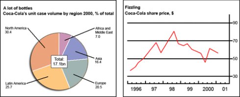
д�����ģ�
The pie chart shows the worldwide distribution of sales of Coca-Cola in the year 20## and the graph shows the change in share prices between 1996 and 2001.
In the year 2000, Coca-Cola sold a total of 17.1 billion cases of their fizzy drink product worldwide. The largest consumer was North America, where 30.4 per cent of the total volume was purchased. The second largest consumer was Latin America. Europe and Asia purchased 20.5 and 16.4 per cent of the total volume respectively, while Africa and the Middle East remained fairly small consumers at 7 per cent of the total volume of sales.
Since 1996, share prices for Coca-Cola have fluctuated. In that year, shares were valued at approximately $35. Between 1996 and 1997, however, prices rose significantly to $70 per share. They dipped a little in mid-1997 and then peaked at $80 per share in mid-98. From then until 20## their value fell consistently but there was a slight rise in mid-2000.
WRITING TASK 2��
You should spend about 20 minutes on this task.
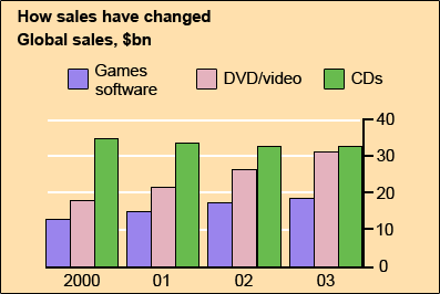
- The chart below gives information about global sales of games software, CDs and DVD or video.
- Summarise the information by selecting and reporting the main features, and make comparisons where relevant.
You should write at least 150 words.
Model answer��
The chart shows the changes in the sales of video material / DVDs, games software and CDs around the world in billions of dollars over a three-year period. It can be seen that the sales of videos / DVDs and games software have increased, while the sales of CDs have gone down slightly.
Between 20## and 2003, the sale of videos and DVDs rose by approximately 13 billion dollars. In 2000, just under 20 billion dollars worth of these items were sold, but in 2003, this figure had risen to a little over 30 billion dollars.
The sales of games software also rose during this period, but less sharply. Sales increased from about 13 billion dollars in 20## to just under 20 billion dollars three years later. By contrast, during the same time period, the sale of CDs fell from 35 billion dollars in 20## to about 32.5 billion dollars in 2003.