雅思小作文: 饼状图一例
Many women want or need to continue working after they have children. The chart below shows the working after they have children. The chart below shows the working pattern of mothers with young children.
作文写作要点:
介绍各扇面及总体的关系。
各个扇面之间的比较,同类扇面在不同时间、不同地点的比较。
重点突出特点最明显的扇面:最大的、 最小的、互相成倍的。
The basic trends of the four charts:
Just after bearing children, back to work.
The older child…the more…
Most part-time during child 5~9
Child 10+, full time double, part-time less
the introduction can be written like this:
Even just after having a child, a large number women return to work. As the child grows older, the percentage of mothers who choose or need to continue working rises. At least until the child is ten, the larger number of working mothers take part-time occupations. When the child is ten years or older, the number of the full-timers more than doubles while that of the part-timers decrease.
Each chart entails / contains instruction, which illustrates what the chart involves rather than the over trends.
Writing Paragraphs:
Information analyzed according to the pie charts.
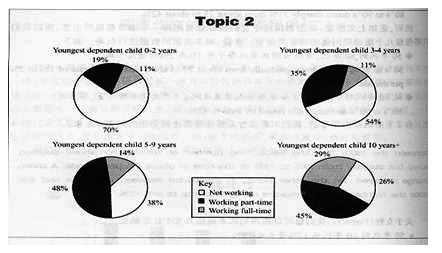
Child 0~2, 30% back to work (19p.t., 11f.t.)
3~4, p.t. up dramatically to 35%, f.t. same
5~9, p.t. up consistently to 48%, f.t. slight increase to 14%
10+, p.t. slightly 3% down, f.t. double to 29%
Paragraph 1:When the youngest child is at most 2 years old, 30% of the women return to work. 19% full-time, and 11% as part-timers.
Paragraph 2:The percentage of full timers remains the same until the child turns five and increased slightly to 14% when the child is at most 9 years old, but the percentage of part-time working mothers grows dramatically to 35 and continues growing to 48% by the time the child is 9.
Paragraph 3:A change occurs after the child grows to ten. The number of full-time working mothers doubles in percentage to 29, while that of the part-timers is reduced slightly to by 3% to 45%.
Conclusion:It appears that, when the child turns to ten, women have much fewer maternal responsibilities than the years before.
Sentence Patterns:
Introduction:
The (two) pie charts show (reveal, suggest, illustrate, demonstrate, indicate, describe, relate) the proportion (percentage) of A and B… in (7) (categories), divided into…and…(one is…, another is…)
Comparison:
1、The biggest difference between (2) groups is in …, where A makes up % while (whereas) B constitutes % (makes up=constitutes=accounts for)
the highest percentage / amount of A, which was approximately %, was for…. (=in) /was found in
2、The percentage of A in … is more than twice the percentage of B, the ration is % to % (% compared to %)
3、In…, while there is (not) a great deal of difference between the percentage of A and B (the former is % and the latter is %).
in …, while a greater percentage of A than B are found in… (the former is % and the latter is %).
4、There are more A (in …), reaching %, compared with % of B
5、By contrast, A has increased (declined), from % in …to % in ….
Compared with B, A …
Conclusion:
To sum up
In conclusion
It appears that…
The two charts clearly show…
第二篇:雅思小作文组合图范文和写作思路
今天,环球雅思为正在备考雅思写作的考生介绍雅思小作文组合图范文和写作思路。我们先从雅思小作文组合图范文开始:
雅思小作文组合图一:
Write a report of at least 150 words outlining the main features of the date presented and making comparisons where relevant,
The figures below show spending on leisure activities as a percentage of total household spending in seven European countries.
The figures below show the average annual expenditure ( in pounds ) on recreational activities per household in the U.K.
雅思小作文组合图范文
The bar chart shows how much money is spent in seven European countries on free time activities as a percentage of total household spending whilst the pie chart shows the average amount of money spent each year by households in the UK on various leisure activities.
UK households spend the highest percentage of money on leisure activities(21.3%). Those in Sweden, Austria and Germany spend similar percentages on leisure activities 18.4%, 17.7% and 16.8% respectively. Households in Greece and Portugal spend smaller percentages 13.3% and 12.9% respectively. Those in italy spend the lowest percentage on leisure activities at 10.9%
UK households spend an average of 2868 on leisure activities each year. Half of this (1431) is spent on outdoor activities. About 20% (588 ) goes towards culture and sport. 313 goes towards electrical goods and music. Spending on reading material and on holidays is the same at 268.
From the bar chart and the pie chart, we can see that the percentage of household spending given over to free time activities varies considerably between different European countries and that, in the UK, the free time activities that take the largest chunk of money are outdoor ones. (字数:194)
雅思小作文组合图二:
雅思小作文组合图范文
The graph and table below give information about water use worldwide and water consumption in two different countries.
雅思小作文组合图写作思路:
Introduction - rewrite the question in a different way.
Summary - write one sentence summarising the trend shown on the graph, and one sentence summarising the table.
Details paragraph - describe the graph in detail (maybe 3 sentences).
Details paragraph - describe the table in detail (maybe 3 sentences).
雅思小作文组合图范文:
The charts compare the amount of water used for agriculture, industry and homes around the world, and water use in Brazil and the Democratic Republic of Congo.
It is clear that global water needs rose significantly between 1900 and 2000, and that agriculture accounted for the largest proportion of water used. We can also see that water consumption was considerably higher in Brazil than in the Congo.
In 1900, around 500km? of water was used by the agriculture sector worldwide. The figures for industrial and domestic water consumption stood at around one fifth of that amount. By 2000, global water use for agriculture had increased to around 3000km?,
industrial water use had risen to just under half that amount, and domestic consumption had reached approximately 500km?.
In the year 2000, the populations of Brazil and the Congo were 176 million and 5.2 million respectively. Water consumption per person in Brazil, at 359m?, was much higher than that in the Congo, at only 8m?, and this could be explained by the fact that Brazil had 265 times more irrigated land.
希望以上环球雅思整理推荐的雅思小作文组合图范文和写作思路介绍,对大家的雅思小作文柱状图有所启发。更多相关精彩学习方法介绍尽在环球雅思!