You should spend about 20 minutes on this task. Write a report for a university
lecturer describing the information shown below. You should write at least 150 words.
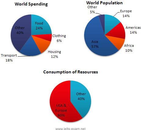
In this analysis we will examine three pie charts. The first one is headed ‘World Spending.’ The second is ‘World Population’ and the third is ‘Consumption of Resources.’
In the first chart we can see that people spend most of their income (24%) on food. In some countries this percentage would obviously be much higher. Transport and then housing are the next major expenses at 18% and 12% respectively. Only 6% of income is spent on clothing.
In the second chart entitled ‘World Population’, it is not surprising to find that 57% of people live in Asia. In fact China and India are two of the most populated countries in the world and they are both situated on this continent. Europe and the Americans account for nearly 30% of the total, whilst 10% of people live in Africa.
Finally, the third chart reveals that the USA and Europe consume a huge 60% of the world’s resource.
To sum up, the major expenditure is on food, the population figures are the highest for Asia and the major consumers are the USA and Europe.
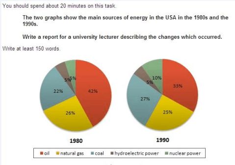
The two graphs show that oil was the major energy source in the USA in both 1980 and 1990.
It is manifest from the pie charts that coal, natural gas and hydroelectric power remained in much the same proportions. On the other hand, there was a dramatic rise in nuclear power, which doubled its percentage over the ten years.
Oil supplied the largest percentage of energy, although the percentage decreased from 42% in 1980 to 33% in 1990. Coal in 1990 was the second largest source of energy, increasing its proportion to 27% from 22% in the previous decade. Natural gas, the second largest source in 1980 at 26%, decreased its share very slightly to provide 25% of America’s energy ten years later. There was no change in the percentage supplied by hydroelectric power which remained at 5% of the total energy used. Nuclear power the greatest change: in 1990 it was 10%, twice that of the 1980s.
占…比例: Occupy account for take part in
剑4 P54 剑8 P53 剑8 p3 剑7 p101
第二篇:雅思小作文-饼图1
A1-1
You should spend about 20 minutes on the task.
The diagrams below show the various kinds of water found on the earth and how it is used in three different countries. Write a report for a university lecturer describing the information shown below.
Write a report for a university lecturer describing the information shown below.
You should write at least 150 words.
Sample (by Torben K.Nelson)
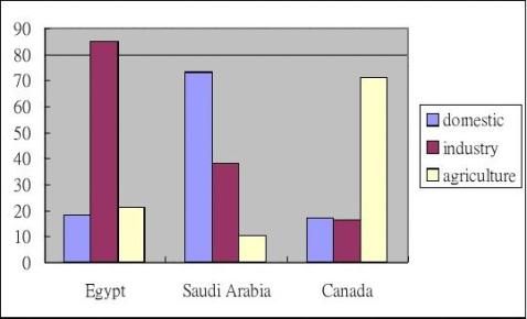
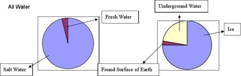
The graphs illustrate the total amount of water used in the world and how it is used across three different countries. The two pie charts generally show that the type and distribution of the world’s water is primarily made up of salt water and ice, while from the bar chart it is possible to see that the three countries use very different amounts of water for domestic, industrial and agricultural use.
The first pie chart shows that 95% of the world’s water is salt water. From the second pie chart it is possible to see that 75% of the world’s water is made of ice, while 21% is underground water and the remaining 4% is found on the surface of the earth.
The bar chart depicts that domestic use of water was the highest for Saudi Arabia, peaking at 72 million litres of water. In contrast, both Egypt and Canada use less than a third of that amount. In regards to the highest consumption of water for industrial use, Egypt was first at 85 million litres of water, while Saudi Arabia was less than half of that amount at 38 million, and Canada at only 17 million. Finally, agricultural use of water was the highest for Canada at 71 million litres of water. However, Egypt uses a lower amount at 21 million and Saudi Arabia is the lowest user at half of that amount.
In conclusion, while a similar amount of total water consumption is evident across Egypt, Saudi Arabia and Canada, each country uses the world’s water for different purposes.