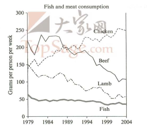
篇一 :雅思表格图范文

     WRITING TASK 1 2-3


You should spend about 20 minutes on this task


The first chart below shows the results of a survey which sampled a cross-section of 100,000 people asking if they travelled abroad and why they travelled for the period 1994-98. The second chart shows their destinations over the same period.

Summarize the information by selecting and reporting the main features and make comparisons where relevant.


You should write at least 150 words.

     WRITING TASK 1 (7-1) 课件


You should spend about 20 minutes on this task


The table below gives information on consumer spending on different items in five different countries in 2002.

Summarize the information by selecting and reporting the main features and make comparisons where relevant.

…… …… 余下全文

篇二 :雅思写作_表格图范文

表格图范文

The table below gives information about underground railway systems in six cities.

Underground Railway Systems

范文:


…… …… 余下全文

篇三 :雅思写作Task1表格图考官范文(4)


雅思写作Task1表格图考官范文(4)

  本文为大家收集整理了雅思写作Task1表格图考官范文(4)。认真研读一定的雅思范文及作文模板可以帮助我们检验自己的写作水平,并能很好地吸收和应用优秀范文里的优秀内容。

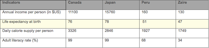
  The table below shows social and economic indicators for four countries in 1994, according to United Nations statistics.

  Describe the information shown below in your own words. What implications do the indicators have for the countries?


  Model Answer:

  The provided table compares four important economic and social factors of four countries namely Canada, Japan, Peru and Zaire for the year 1994. As is observed from the given data, Canada and Japan has a far more better economic and social conditions than the other two countries.

  We can observe from the given information that, Japan has the highest literacy rate (99%), per person annual income (USD 15760), longest life expectancy (78 years) and second highest (2846) daily calorie supply per person. Again Canada is another country with a very good social and economic situation that has 99% literate population, USD 11100 per person annual earning, 76 years life expectancy and the highest daily calorie supply per person which is 3326. On the contrary the other two countries have poorer economic and social conditions. Peru has only $ 160 annual income per person which is 98 times less than Japan and they have only 68% adult literate compared to the 99% of other two developed countries. Zaire has the worst economic and social condition among these four countries with the least adult literacy (only 34%), 130 USD annual per person income, 1749 daily calorie supply and only 47 years life expectancy.

…… …… 余下全文

篇四 :雅思写作小作文线形图表题(附范文)

雅思写作 – LINE GRAPH

WRITING TASK 1 (Test 2, Cambridge IELTS 7)

You should spend about 20 minutes on this task.

Write at least 150 words.


范文

  The graph illustrates changes in the amount of beef, lamb, chicken and fish consumed in a particular European country between 1979 and 2004.

   In 1979, beef was by far the most popular of these foods, with about 225 grams consumed per person per week. Lamb and chicken were eaten in similar quantities   (around 150 grams), while much less fish was consumed (just over 50 grams).

  However, during this 25-year period the consumption of beef and lamb fell dramatically to approximately 100 grams and 55 grams respectively. The consumption of fish also declined, but much less significantly to just below 50 grams, so although it remained the least popular food, consumption levels were the most stable.

…… …… 余下全文

篇五 :雅思写作表格图解题策略

在雅思考试A类小作文的四大基本图形(即曲线图、柱形图、饼图和表格图)中,表格图往往是广大考生所最头疼的图形了,很大一部分考生会碰到以下状况,比如表格看懂了,但是因为数据繁多而且凌乱,一时半会儿找不出很明显的特征,不知从何下手;或是找到了很多特征,但是不知道用什么样的顺序、结构和衔接方式把这些特征条理清晰地传达出来;又或是大体清楚该写什么,怎么写,但是在具体写的时候,老是丢三落四的,把一些信息给遗漏掉了等等。这时,考生所面临的主要不是语言方面的问题,而是写作步骤和写作思路方面的问题,也就是不知道应该用什么样的步骤和思路把表格图中那些看似复杂无序的数据自然而且毫不遗漏地贯穿起来。本文将主要针对表格图的写作步骤及其写作思路展开探讨。

下面将用一个典型的表格图实例来说明此类图形的解题策略。

The table below lists the number of nights of occupancy of hotel rooms in Australia during the peak month of September in the years 20## and 20## and the difference expressed in percentage.

首先,拿到考题以后,快速浏览题目中的文字信息,即The table below lists the number of nights occupancy of hotel rooms in Australia during the peak month of September in the years 20## and 20## and difference expressed in percentage,重点关注研究对象(nights occupancy)、数据类型(number and percentage)和时间(2000 and 2001)这三大要素,明确在主体段的写作中要注意数据类型的变化和时态一致问题。

其次,看题目中的表格图形,看图形时也要先看文字说明,包括标题、标注和单位,弄懂数据所代表的信息,而非数据本身。一般情况下,表格图中的文字说明还是比较容易识别的,就如同曲线图中的横纵轴一样。上图中横向代表不同的时间,纵向则代表不同的地区。但是通常表格的最后一列和最后一行要特别注意,有可能是数据的叠加、平均或者对比,这张图也是如此,最后一列代表不同时间之间的变化趋势及幅度,最后一行则是数据和变化的总结,曾经就有比较粗心的同学,出现了“Australia Total”的数量最多的笑话。同时,标题下方的单位(in thousand)和change前面的%千万不能遗漏,不然后面写的数据都是不准确的。

然后,筛选信息,圈关键数据。表格图写作不是记流水帐,需要面面俱到,但是关键数据可是一个都不能少的。为了防止遗漏,建议考生可以在看题的过程中把这些数据都圈出来,通常包括总数、极值、突变值等等,就上图而言,以下数据必不可少:总数(20##年3562.6、20##年3476.0),总变化(2.4),极值(20##年最大1299.9,最小71.2;20##年最大1135.8,最小70.9;变化增长最多21.8,减少最多12.6),一共9个数据可视为必要数据,在文章中必须要提及,至于其他数据就可写可不写了。

再则,整理写作思路,也就是写作顺序。作为总数、平均数或者对比数据,通常放在文章开头总起或者结尾总结,所以这些数据可以先不考虑。剩余的数据,则只有两种写作顺序,横着写或者竖着写,肯定不可能斜线写的。在上图中,横着写,就是对比相同地区在20##年和20##年不同年份之间的数据,其实也就是最后一列变化情况比例或者说趋势;竖着写,就是对比不同地区在20##年或20##年同一年份中的数据。此图中由于既出现了类别(地区),又出现了时间,所以既要横着写,也要竖着写。若是只有类别比较或者只有时间比较,那么横写竖写选其一即可。

最后,就是落笔成文了,运用平时积累和归纳的词汇句型以及连接手段,把必要数据和关系对比,遵循刚才整理清楚的写作思路,有机地串连起来,形成文字即可。时间允许的话,还可以进行快速的检查,看看有无数据遗漏、时态疏忽、单词误拼等小问题。

总之,表格图并没有想象中的那么难,了解图形特点,掌握解题策略,积累表达手段,辅以3-5篇的练习,一篇出色的表格图作文是完全有可能出自你的笔下的,因此“临渊羡鱼,不如退而结网”,现在就开始行动吧!

…… …… 余下全文

篇六 :雅思写作Task1表格图考官范文(3)


雅思写作Task1表格图考官范文(3)

  本文为大家收集整理了雅思写作Task1表格图考官范文(3)。认真研读一定的雅思范文及作文模板可以帮助我们检验自己的写作水平,并能很好地吸收和应用优秀范文里的优秀内容。

  The table below shows the sales at a small restaurant in a downtown business district.

  Summarise the information by selecting and reporting the main features, and make comparisons where relevant.

  表3.jpg

  Sample Answer:

  The provided table represents information on sales of a downtown small restaurant of a typical October week starting from the 7th October till 13th October. As is presented, the restaurant's earning from dinner is much more than the earning from lunch except for the weekend, Sunday.

  In Monday, the beginning of the week, the restaurant sells lunch of 24 hundred dollar compared to the sell of dinner of 3623 dollar. The sell of dinner compared to lunch is significantly higher than the sell of lunch for the six days of the mentioned week except for the Sunday. The sell of lunch in Tuesday remains almost same as it was in Monday but the dinner sell increased by almost 200 dollar. The earning from the dinner is lowest in Saturday and it is less than 3000 dollar. In the weekend the lunches bring an amount of 1550 dollar compared to 2450 dollar dinner.

…… …… 余下全文

篇七 :雅思写作Task1表格图考官范文(2)


雅思写作Task1表格图考官范文(2)

  本文为大家收集整理了雅思写作Task1表格图考官范文(2)。认真研读一定的雅思范文及作文模板可以帮助我们检验自己的写作水平,并能很好地吸收和应用优秀范文里的优秀内容。

  The table below gives information about the underground railway systems in six cities.

  Summarise the information by selecting and reporting the main features, and make comparisons where relevant.


  Sample Answer:

  The supplied table gives data on underground railway system in six metropolitan cities namely: London, Paris, Tokyo, Washington DC, Kyoto and Los Angeles. As is observed, London railway system is the oldest among six and has the longest rail route and the most recent railway system in Los Angeles having a small route and fewer passengers using the railway system each year.

  London railway system was opened in 1863 and has a total of 394 km. route. Paris railway system was started in 1900 and has 199 km. route but has a larger passengers (1191 million per year) than the London railway (775 million passengers per year). Again, Tokyo railway has the largest passengers using the system and this railway station was started in the year 1927.

…… …… 余下全文

篇八 :雅思写作Task1表格图考官范文(1)


雅思写作Task1表格图考官范文(1)

  这是一篇雅思写作Task1表格图考官范文,供大家参考。认真研读一定的雅思范文及作文模板可以帮助我们检验自己的写作水平,并能很好地吸收和应用优秀范文里的优秀内容。

  The first chart below shows the results of a survey which sampled a cross-section of 100,000 people asking if they traveled abroad and why they traveled for the period 1994-98. The second chart shows their destinations over the same period.

  Write a report for a university lecturer describing the information shown below.


  Sample Answer:

  The provided charts shows the data of a survey conducted on 100,000 people and the statistics shows the number of UK citizen travelled abroad during 1994 to 1998 for different purposes and their destinations. As is observed from the given graphs, most of the UK residents travelled on their holidays and Western Europe was their most favourite destination.

…… …… 余下全文