雅思小作文饼图写作技巧总结
饼图是雅思小作文写作中最常见的一种形式,所以大家在备考雅思小作文写作的时候,一定要准备一些关于饼图的雅思小作文写作技巧。下面就为大家搜集整理了这类题型写作技巧,供大家参考,希望给大家带来帮助。
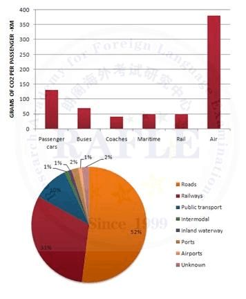
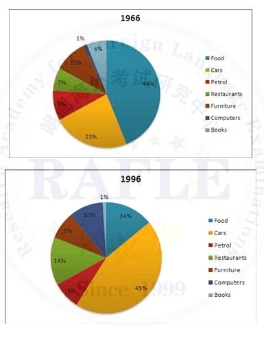
饼形图与柱形图或者是线形图所截然不同的是它没有了横轴与纵轴,而以饼形的分割来表示百分比,但我们仍可以依照三步的审题分析法来进行观察:
Step 1: 观察共有几张饼图,以及它们之间的关系是什么(一般说来,雅思图表题中极少见到单饼图);
Step 2: 观察每张饼图中有哪几个区域,以及各个区域分别代表什么;
Step 3: 观察单个饼图中各区域间的百分比差异,以及相同区域在各个饼图间的百分比的比较或发展。
现在我们就来分析一下下面的饼形图:
Many women want or need to continue working even after they have children. The charts below show the working patterns of mothers with young children to care for.Write a report for a university lecturer describing the information on the charts below.
Step 1: 一共有四张饼图,它们分别按照由母亲照料的最年幼孩子的年龄大小来进行排列,从0 ~ 2岁到10岁以上;
Step 2: 每张饼图中都有三种区域:白色区、深色区和浅色区。它们分别表示母亲的工作状态:白色区为“没有工作”,深色区为“兼职工作”,浅色区为“全职工作”; Step 3: 白色区在0 ~ 2岁时处于绝对优势,占70%,而随着孩子年龄的增长,白色区渐渐地变小,在10岁以上时只有26%;深色区在孩子年幼时比例很小:0 ~ 2岁时只有19%。随着孩子的长大,深色区急剧扩张,在5 ~ 9岁时达到顶峰,占48%,但在10岁以后却轻微下降到45%;而浅色区的变化则是在同一时期内分别占到了11%,11%,14%和29%。 当然,在开始写文章之前,我们还必须决定文章所用的时态。在这张图的要求里,并没有说是过去的时间里做的调查,因此我们就默认为是一般现在时。
…… …… 余下全文